Mobile V Desktop Content Optimisation
According to Amazon, mobile accounts for 80% of all traffic on their platform. Amazon has made the mobile shopping experience incredibly seamless for consumers via their app. Amazon now leads the ranking of the most popular shopping app in the United States, with 150.6 million mobile users in 2019.
Consumers typically follow a similar trend whereby 80% of consumers begin their browsing on mobile, but 67% make their purchase through desktop. Consequently, brands must optimise their content with both desktop and mobile users in mind.
COPY
Content layout varies between desktop and mobile, meaning different elements of the product display page become more valuable than others when educating the shopper. It is important to keep in mind that the rise in mobile shoppers on Amazon reiterates that people tend not to read, they scan. Therefore, copy needs to be simple.
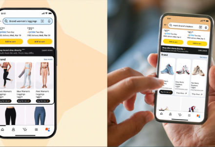
For those browsing on a smaller screen, product titles need to be short and concise. Titles are especially important on mobile platforms as they are the only information given to the shopper ‘above the fold’ (mobile users can see the title, images and price, but they must scroll down past the buy box to see other content). We recommend that titles should clearly lead with the most important information within the first 150 characters, such as; brand, product, USPs and size.
Descriptions hold far greater importance on mobile in comparison to desktop for a few reasons:
Descriptions appear above bullet points on the product display page
Descriptions are the first block of copy visible to the shopper
Descriptions are only 200 characters long (the remaining copy is available when expanded) so they need to be short, concise and include key product information.
Bullet points are shown at the end of the product display page, below the A+ content on mobile. Many consumers may not scroll this far down on mobile, but all real estate that’s available should still be utilised. We recommend to include 5 x bullet points outlining the main product USPs and keywords.
IMAGES
Along with the title, the product images are the first thing the customer sees on the PDP. It’s important that images are eye-catching, engaging and educational. Customers swipe from left to right to see images on a mobile and top to bottom on a desktop. Either way, the most important information you want to get across to the customer needs to be included within the first few images.
Top tip: Image copy overlay needs to be big enough to read on mobile due to the smaller screen. As a general rule of thumb, if copy seems hard to read on a desktop, it will be too small on mobile.
A+ CONTENT
A+ content is arguably more prominent on mobile than desktop. On mobile, content appears above the bullet points and each module takes up the entire screen on mobile. This means content is more eye-catching and holds greater power when educating and persuading the consumer.
One key difference with the A+ content is the comparison chart. On desktop, the shopper can view up-to 6 products at one glance, whereas on mobile, the consumer can only see the first 3 products in the chart (when scrolling across the shopper can see the remaining chart). We recommend showcasing your top sellers, or those you want to cross-sell within the first 3 columns.
We also recommend that sellers utilise A+ Premium where possible, as module options are greater and more interactive (see our blog on A+ premium HERE). With A+ premium, you can easily upload desktop-sized assets and mobile-sized assets per module, so content is set up for optimum viewing for all shoppers.
BRAND STORE
Brand Store content is especially important to consider when optimising for mobile and desktop. Mobile screens are narrower and designed for faster scrolling, which means that the order and layout of content differs. Mobile Stores use a left-to-right row prioritisation for the order of content, whereas desktop uses top to bottom.
On desktop, customers see multiple tabs along the navigation bar. On mobile, shoppers see a single drop-down menu. This is an important factor to consider when highlighting your top categories or pages in a Store. Putting those top pages in the menu is one good strategy, but you can also use tiles to create an additional way to navigate your Store. Adding these tiles to the top of the Store ensures shoppers can find your most important content, even if they don’t expand the drop-down menu.
For both mobile and desktop, it’s important to include Call To Actions (CTAs). However, on mobile, CTAs should also have decent spacing around them so it’s easy for customers to find and click on it. Having limited space for a CTA can cause it to merge with its surroundings and lose visibility.
Due to the screen size difference, sometimes a tile design is legible on desktop but not on mobile. Although Stores automatically adjust images for desktop and mobile viewing, this doesn’t mean every element will be legible on mobile. If copy overlay is ineligible, it is necessary to create two assets; one for desktop and one for mobile.
Lastly, the header for mobile and desktop is unlike a tile, the height and dimensions of the image cannot be changed. The dynamic resizing of the Store for mobile will shrink all graphic elements within the header, including text. Therefore, the mobile header can look more cluttered. Our advice is to keep the header simple, limit copy, font size of 90pt Arial regular or equivalent and limit the number of products to 3.
Top tip: Always preview mobile and desktop before you publish to ensure both are eligible.


Although consumers begin their search with mobile, they still make the all important purchase through desktop. Therefore, it is important to tailor content with both mobile and desktop shoppers in mind.
If you need help or you have any questions regarding content optimisation on Amazon, please reach out to our content team, we’d be happy to help!
Beth Fisher, Senior Content Executive
Image Credit: Online Design Teacher